Hyper Online

Hyper's iOS app had 11,000 reviews and a 4.6 rating when I was brought in to design its desktop version. The challenge was simple to describe and difficult to execute: make it feel native to desktop without making it feel like a different product.

ROLE

LEAD PRODUCT DESIGNER

STAGE

YC BACKED

YEARS

2023 — 2025

SCOPE

DESKTOP APP · UX · DESIGN SYSTEM · COMPONENT SPECS

STATUS

SHIPPED 2024 · IOS + STEAM
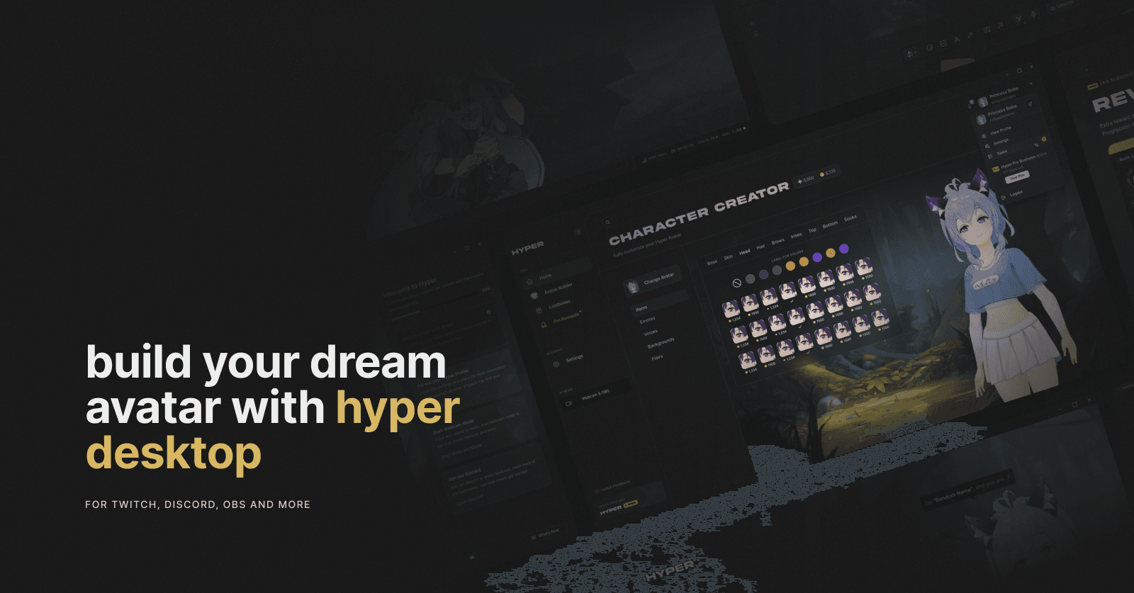
Hyper by Erik Padamans

§ 01 / CONTEXT

Hyper lets people build an avatar, track their face and stream or record as that character.

By the time I joined, the iPhone and iPad apps already had an established audience. The next request was desktop.

That meant designing for a very different environment without throwing away what existing users already knew.

§ 02 / PROBLEM

This could not be a redesign. Users were already asking for the desktop version, engineering time was short, and parts of the interface render through Unity, which limits what can be moved and how.

Mobile assumes a thumb and one screen at a time. Desktop gives you a cursor, a keyboard and room to keep several things visible.

The question wasn't what to add. It was what to change, and what to leave alone.

§ 03 / DECISIONS

01

Familiar where it matters

Everyone waiting for the desktop app already knew the mobile one. I kept the vocabulary, hierarchy and core mental model intact, then changed the layout around the way desktop is actually used.

Same product. Different workspace.

01

Familiar where it matters

Everyone waiting for the desktop app already knew the mobile one. I kept the vocabulary, hierarchy and core mental model intact, then changed the layout around the way desktop is actually used.

Same product. Different workspace.

01

Familiar where it matters

Everyone waiting for the desktop app already knew the mobile one. I kept the vocabulary, hierarchy and core mental model intact, then changed the layout around the way desktop is actually used.

Same product. Different workspace.

02

The avatar gets the screen

The entire builder exists to change the avatar, so the avatar became the largest thing on screen. On mobile, the preview had to compete with the item list. Desktop gave me enough space to stop making that trade.

Pick an iris. See the result immediately.

02

The avatar gets the screen

The entire builder exists to change the avatar, so the avatar became the largest thing on screen. On mobile, the preview had to compete with the item list. Desktop gave me enough space to stop making that trade.

Pick an iris. See the result immediately.

02

The avatar gets the screen

The entire builder exists to change the avatar, so the avatar became the largest thing on screen. On mobile, the preview had to compete with the item list. Desktop gave me enough space to stop making that trade.

Pick an iris. See the result immediately.

03

Controls stay with the work

Blendshapes, tracking, scenes, aspect ratio, chroma key... on mobile these exist behind nested menus because there is nowhere else to put them.

On desktop, I kept them close to the thing being edited. Panels could open side by side, stay visible while you work, or disappear when you don't need them.

03

Controls stay with the work

Blendshapes, tracking, scenes, aspect ratio, chroma key... on mobile these exist behind nested menus because there is nowhere else to put them.

On desktop, I kept them close to the thing being edited. Panels could open side by side, stay visible while you work, or disappear when you don't need them.

03

Controls stay with the work

Blendshapes, tracking, scenes, aspect ratio, chroma key... on mobile these exist behind nested menus because there is nowhere else to put them.

On desktop, I kept them close to the thing being edited. Panels could open side by side, stay visible while you work, or disappear when you don't need them.

§ 04 / SYSTEM

Engineering time was the tightest constraint, so the design had to remove questions before they reached engineering.

I specced components down to their actual states: hover, empty, loading, disabled, animation timing and everything in between.

A module could be built without coming back to me for every decision.

§ 05 / SHIPPED

A desktop product that felt familiar to existing users, but took advantage of the space and interaction model they had been asking for.

The desktop app shipped without rebuilding the underlying product.

It extended an established mobile experience onto a new platform, backed by a design system and component specs built for the job.

§ 06 / NOW

I finished the project in January 2025.

A few months later, Hyper shut down its servers and the app became offline-only.

The desktop release itself shipped as planned, extending an established mobile product onto a new platform without forcing the team into a rebuild.

"It offers a clean interface that is easy to use. Talent is highlighted neatly in the top corner upon opening the app, amongst other valuable information and promotions, unlike the messy interfaces of the competition..."

one of the top-voted app reviews / Hyper online user