§ 00.A
BRAND COLLECTION
Seven marks over the past two years, most of them for software companies where customers meet the brand as an app icon before they see it anywhere else. Four belong to one client, a Brazilian govtech group operating across more than 200 municipalities.
TYPE
BRAND IDENTITY
YEARS
2025 — 2026
SECTORS
FINTECH · B2B SAAS · URBAN MOBILITY
SCOPE
MARKS · LOGOTYPES · BRAND SYSTEMS · GUIDELINES
STATUS
SHIPPED 2026 · ACTIVE DEVELOPMENT

§ 01 / CONTEXT
Most of the brand work that reaches me now comes from software companies. A founder with a working product, early customers, and a mark someone made in an afternoon to get the thing shipped.
They ask for a logo. The harder part is that the same form has to hold up as a favicon, an app icon, a nav logo at 24 pixels, and occasionally a sign bolted to a wall.
§ 02 / PROBLEM
A mark presented at 400 pixels on a white slide tells you almost nothing. Everything passes that.
The real test is a phone home screen, twenty apps deep, at a size where most of the detail is gone. A mark that only works large gets found out months later when the app ships and the icon reads as a grey smudge. By then it is expensive to fix, because it is already on the store listing, the invoices and the signage.
So small is where I start rather than where I check.
§ 03 / DECISIONS


§ 04 / SYSTEM
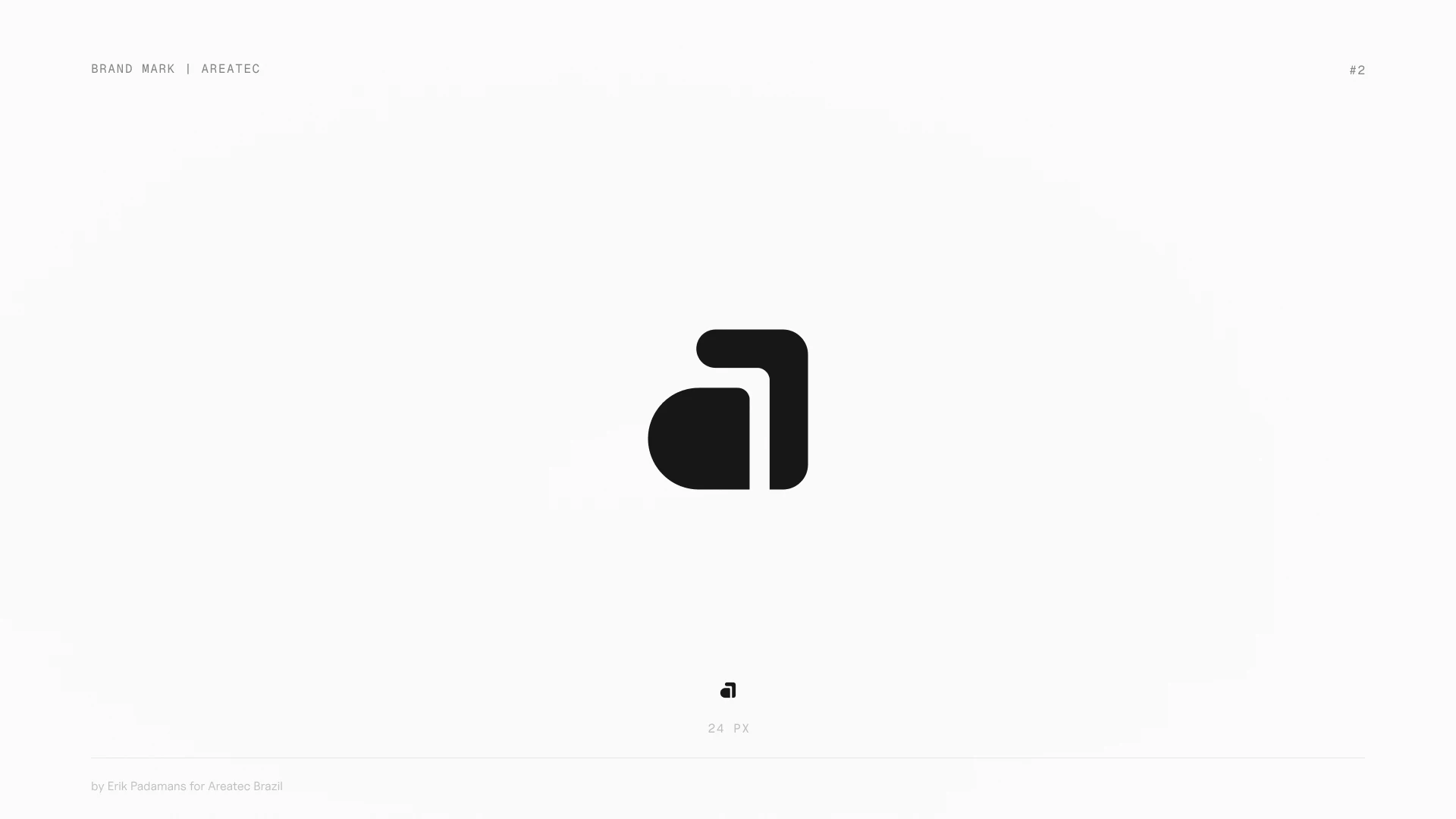
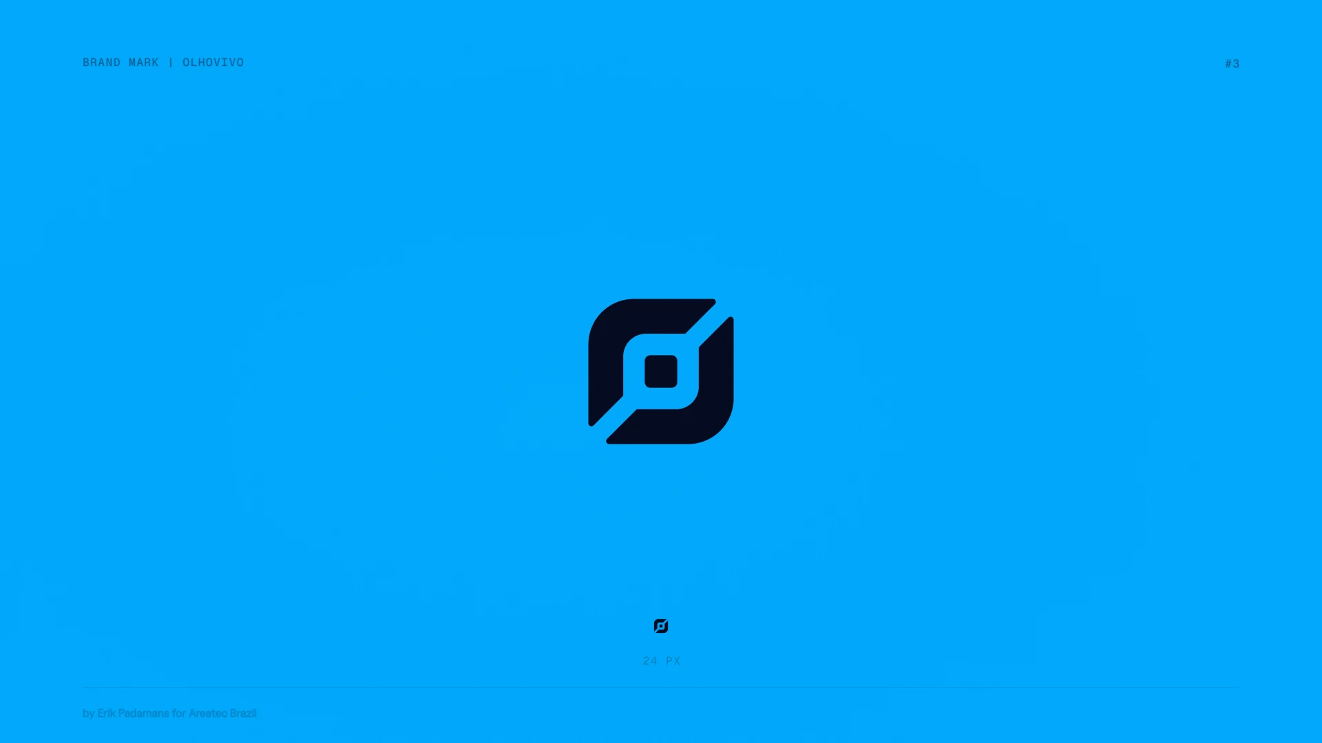
Four of these marks belong to Areatec, a Brazilian company building traffic and parking technology since 1996. They operate the largest OCR fleet in the world across more than 200 municipalities.
The group has a parent company, a driver app, an operations platform for city control rooms, and the layers underneath. Three audiences that share almost nothing: municipal governments, everyday drivers, and operators watching live data come in.
They had to read as one company without looking like the same logo four times. So the marks share construction rather than shape. Same geometric language, same weight, same relationship between form and counterform, a different symbol in each.


§ 05 / SHIPPED
Each engagement delivers the primary lockup, horizontal and stacked variants, monochrome and negative versions, an app icon cut for small sizes, the palette in hex, RGB and CMYK, vector sources, and a guide covering spacing and usage.
The exploration sheets go out with it. Founders approve a direction faster when they can see the ones it beat.

§ 06 / NOW
DealMover and NodeBOM are live. The Areatec marks roll out across the group's platforms this year, starting with the driver app.
Areatec came back for a few more brands after the first three were delivered.
"Erik delivered outstanding work on our brand identity logos for Areatec, Digipare, OlhoVivo, and Qentral. His ability to translate complex tech concepts into clean, modern marks is remarkable. Every deliverable was polished, versatile across formats, and came with thorough brand guidelines."

FÁBIO BATISTELLA / CEO, AREATEC